Context
Proving I could close the loop
I set myself a test. Could I take a project from design to working code entirely on my own?
I picked two real problems to test it on:
- Time Tracker, for tracking my own hours as a consultant.
- Scheduler, built for a client's membership team to run their day-to-day scheduling.
After building both apps I pushed further and built Elegante DS, a design system from scratch, with AI's help but under my direction, and applied it back to both apps. Design, system, code, and back again, closing the loop.
Process
What it actually took to build them
Both apps started with real requirements, not a blank canvas. I mapped out the use cases for each and worked through them until I was confident they actually held up. From there, AI helped me pick the right stack for each app and scaffold the foundation, while I directed the overall concept and the details of specific features and interactions. Once that foundation existed, we iterated feature by feature.
The biggest lesson was about context, not code. Early on, giving AI too little context meant it built features I didn't need, or built the right feature the wrong way. The more specific I was upfront, the better the output.
For styling, I could have kept using shadcn's default components and moved faster. I didn't, on purpose. I wanted proof I could build a design system myself, and I wanted these apps to look like mine, not like every other app built on the same starter kit.
The system
A living design system, exportable as code
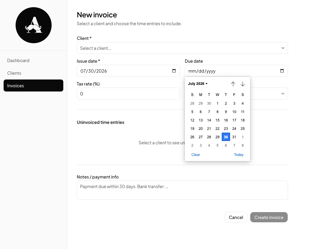
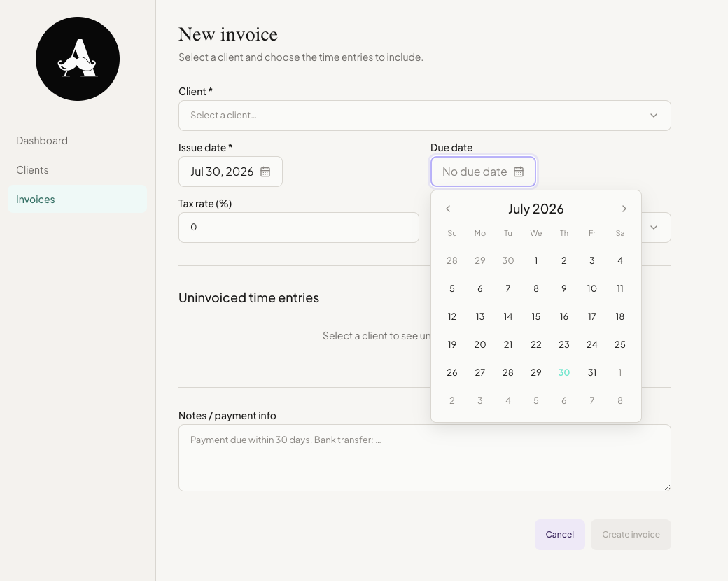
Time Tracker and Scheduler were both built first on shadcn's generic defaults. Once the two apps were working, the second challenge was different: design a living design system, one that could be exported as code so other apps could consume it too, not styles hard-coded into a single project.
Working screens made this easier than starting from a blank token sheet. I could see which spacing, radii, and color roles kept repeating across both apps and use that as the starting point for Elegante's core tokens. Some of the job was also just deciding what Elegante should feel like: how much room to give things, what its visual language was, how the light and dark themes should carry that same personality.
Typography took the most iteration, both the pairing and the sizing. Headings run in DM Serif Display, everything else in Plus Jakarta Sans. Getting the pairing right was only half of it. I also had to define how each size should compress across devices, so a heading that works on desktop doesn't overwhelm a phone screen while body and label text keep the same reading rhythm.
AI tools were used throughout, starting with the token architecture itself: structuring the token collections so the system could scale and support multiple themes down the line. From there it extended to generating and iterating component code, accelerating token extraction from working screens, and drafting documentation as the system took shape.
on smaller screens
Same screen, before and after. The layout and logic didn't change, only the system underneath it.
Design to code
Designed once, shipped once
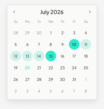
Elegante isn't a code library with a matching Figma file that happens to look similar. Take the Date Picker as one example from the library: in Figma it's built by composing a Popover, a Calendar, and a Day Cell exactly the way the code does. Drag one instance into a mockup and you get the real thing, not an approximation of it.
Both paths lead to the same output. A designer working in Figma reaches for the same tokens a developer reaches for in code, so a color or radius change moves both sides together instead of drifting apart. That's what makes this a living system rather than documentation someone has to remember to update.
Same tokens, not just the same look
--color-primary-default
→
--eleg-primary
--color-calendar-in-range-bg
→
--eleg-calendar-in-range-bg
--radius-full
→
--eleg-radius-full
Figma token → code token. Same value, both places.
import { Popover } from "./Popover";
import { IconButton } from "./IconButton";

export function DatePicker({ trigger, align, ...props }: DatePickerProps) {
  return (
    <Popover trigger={trigger} align={align}>
      {({ close }) => (
        <div className="eg-date-picker">
          <IconButton icon={<ChevronLeft />} onClick={() => goToMonth(-1)} />
          <span className="eg-date-picker__month-label">{monthFormatter.format(viewDate)}</span>
          <IconButton icon={<ChevronRight />} onClick={() => goToMonth(1)} />
          {/* weekday row + day grid follow the same pattern */}
        </div>
      )}
    </Popover>
  );
}The system, live
Elegante DS's actual tokens, running on this page
This isn't a screenshot. Play with the elements, toggle to dark mode, it's live code, not a picture.
Log time
Core input + button pairing from the system.
Product in use
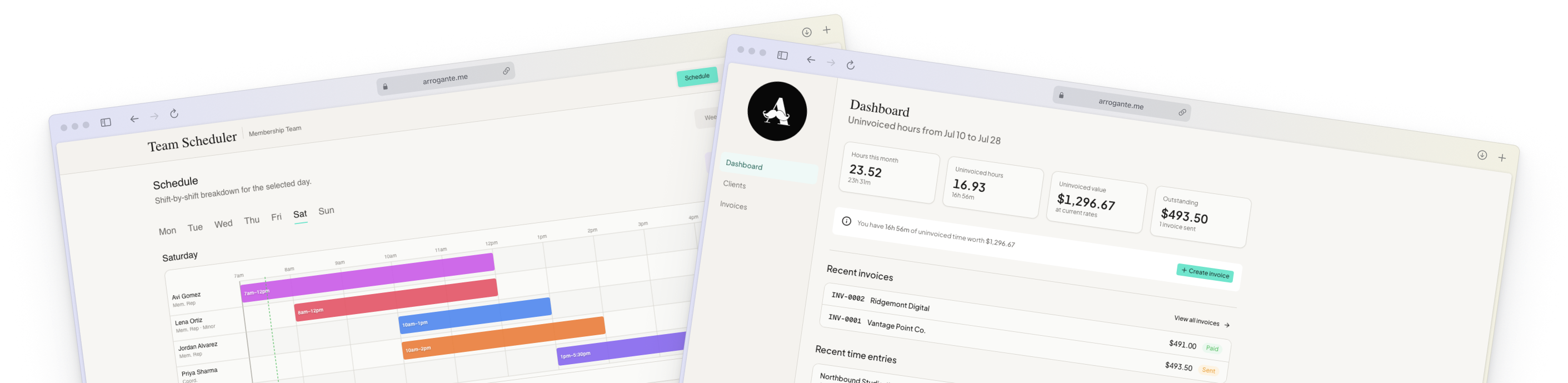
Time Tracker and Scheduler
Working software, not comps. Time Tracker runs my own day-to-day hour tracking and invoicing. Scheduler runs a membership team's daily scheduling, from setup to everyday use.
Outcome
What this proves
- A design system architected and documented with AI assistance, extracted from real product decisions rather than built in isolation.
- Two working products, one personal and one for a client, designed and coded end-to-end from concept through shipped interface.
- Daily, hands-on use of AI tools as part of the actual design workflow, not just the subject of it.
What I'd carry forward
- Context beats cleverness. The more precisely I could describe what I needed, the better AI gave it back, and that's a skill I only get sharper at from here.
- AI became the bridge between Figma and code. Both sides pull from the same tokens, so design and development converge on one source of truth instead of drifting into two versions of the same idea.
- Defaults are the easy path. I took the harder one on purpose, because I wanted these apps to be unmistakably mine.