Context
A newly independent company, inheriting an outdated experience
In 2021, Saks spun its e-commerce business off into a standalone company, with a bold vision to build a modern, tech-driven retail engine that could carry the brand's standard for the next 150 years. I joined as Lead Product Designer, responsible for the shopping experience across web and mobile apps on a platform already serving over 1.2M daily users.
The product hadn't kept pace with that scale. Conversion lagged behind traffic growth, the experience was inconsistent from one surface to the next, and the underlying systems were rigid enough that even small changes were slow and expensive to ship. For a luxury retailer, the digital experience didn't feel luxury.
Process
Grounded in real behavior, not assumptions
I started with a deep dive into the current experience, existing workflows, known friction points, and the UX issues the team already suspected. The 50+ shop-along research sessions that followed reinforced and sharpened those assumptions, watching real customers hit the same friction in real time. From there, I defined the metrics that would actually tell us if a change worked (engagement, conversion, revenue per visit), and partnered closely with engineering to reduce the friction between design and implementation so we could iterate faster.
A few patterns stood out:
- Discovery was broken in places, flows that should have led customers to what they wanted instead led to dead ends.
- Performance and checkout were actively costing trust, slow load times and a checkout without fast, modern payment options frustrated customers before design ever had a chance to help.
- High-value real estate like the homepage and product pages sat underused, with almost no personalization.
- Small changes were hard to test, so problems lingered instead of getting fixed.
Modules I designed
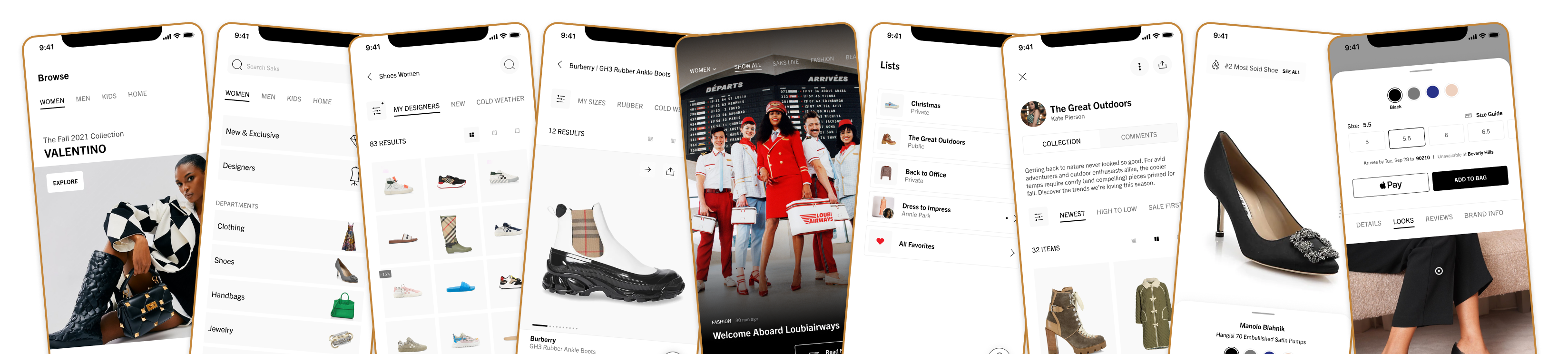
Five surfaces, one modular system
I grounded the redesign in four ways customers actually use the site: browsing with no destination in mind, searching for something specific, engaging with content and trends, and curating and sharing what they found. Personalization then took all of that, how someone browsed, searched, and saved, and used it to reorder their own homepage.
Browse
Browsing for inspiration.
- Curated, editorial-style modules
- Elevated presentation of products and collections
- Designed to mimic a "window display" experience
Search & Explore
Looking for something specific.
- Improved navigation and categorization
- More precise filtering based on product attributes
- A visually-focused browsing experience that broke out of the page-based grid, letting customers fluidly zoom in and out on products
The Edit
Engaging with content and trends.
- Editorial experiences
- Interactive content: stories, polls, curated looks
- A seamless path from inspiration to purchase
The polls and quizzes did double duty. For customers they were a light, entertaining break in the middle of a story. For us they were the cleanest read we had on taste: every answer was a customer telling us directly what they liked and what they didn't.
Lists
Curating and sharing, not just saving.
- Customers could create their own collections and share them with anyone, not just save privately for later
- Friends could comment, react, and purchase items directly from a shared list
- The natural close of the browsing, searching, and discovery loop: save what you love, then bring other people into the decision
Personalized Homepage
Tailored to user intent.
- Dynamic module ordering based on behavior
- Different content for high- vs. low-intent users
- Increased relevance across sessions
All of it ran on the same modular system: reusable components across surfaces, built to support rapid iteration and testing, so personalization could scale without a rebuild every time it changed.
Extending the same idea
The same underlying primitive, create a list, share it, let others act on it, pointed toward two ideas I prototyped but didn't ship: an Outfit Builder that used the same structure to suggest and share complete looks, and a Registry that let a list be built for an occasion and completed by other people. Neither went to production, but both came directly out of what Lists was already doing well.
Outcome
What this proves
Results below are from controlled experiments and a phased rollout, not a single global launch.
The personalization strategy this work fed into was significant enough that Vogue Business covered it directly in August 2025, with Saks Global's Chief Commercial Officer speaking to the AI-enabled push that started with the homepage.
What I'd carry forward
- Real behavior beats assumptions. Fifty-plus shop-along sessions told me more about how customers actually browse than any amount of internal debate could.
- Personalization is a systems problem, not a screens problem. None of the homepage's dynamic ordering would have scaled without the modular system underneath it.
- Measure before you redesign. Defining engagement, conversion, and revenue per visit upfront made it possible to prove which changes actually worked, not just ship and hope.