Context
A shared engine behind three distinct luxury brands
Saks was its own company until it acquired Neiman Marcus and Bergdorf Goodman in December 2024, bringing three distinct luxury retail brands, Saks Fifth Avenue, Neiman Marcus, and Bergdorf Goodman, under one roof, each with its own product, design, and engineering teams. Neiman Marcus and Bergdorf Goodman were behind on technology relative to Saks's own stack, and this design system was one piece of a larger effort to bring their technology up to Saks's standard, on a platform serving over 1.2M daily users.
The system was fragmented in exactly the way you'd expect from three companies becoming one: each brand ran its own tech stack, its own components, its own patterns. There was no shared design language and no consistent experience across brands, which meant every feature got designed and built three times over, at three different levels of quality. Aligning three product, design, and engineering teams around one framework was its own challenge, before a single token got defined.
(Saks Global has since renamed its corporate parent Exemplar Luxury Group; the brands themselves are unchanged.)
Architecture
Core → semantic → component, then brand and platform modes
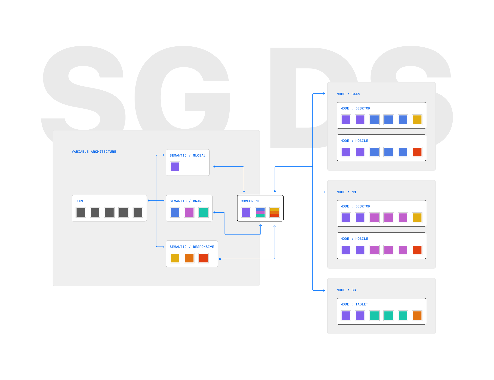
Primitive values flow into global, brand, and responsive semantic layers, then into component tokens, exported as a single library that every brand and platform consumes. Each brand mode (Saks, NM, BG) resolves its own desktop, mobile, and tablet values from that same structure. In practice that's 148 core primitives, 42 shared semantic variables, 319 brand-specific variables across the three brands, and just 32 responsive breakpoint variables, most of this system's weight is brand variation, not screen size.
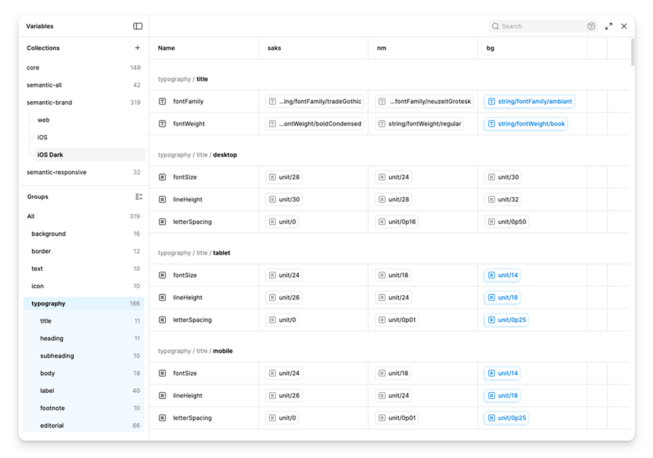
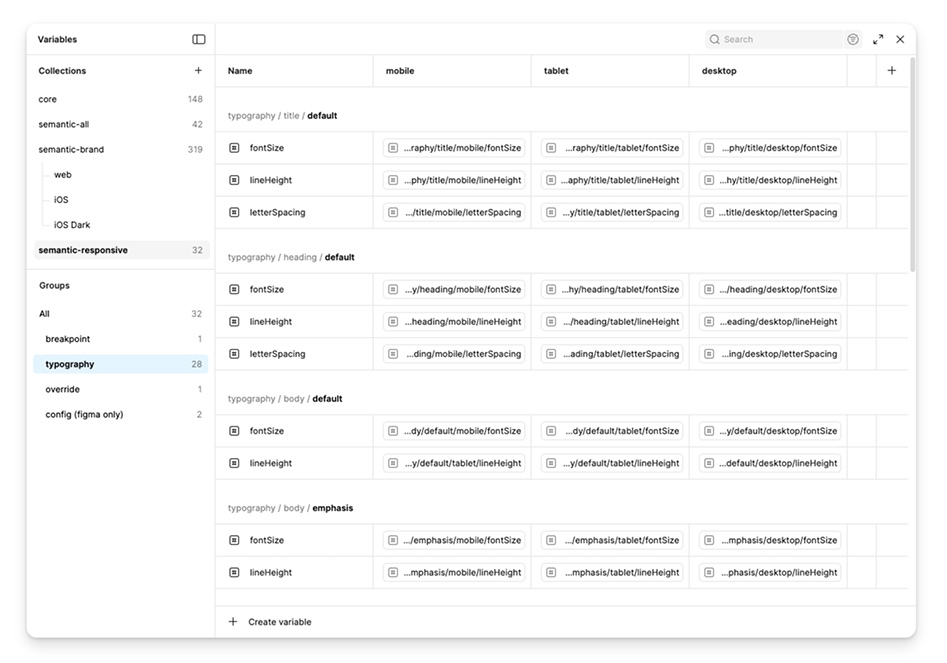
The real Figma file makes that imbalance obvious. The brand layer alone holds ten times as many variables as the responsive layer.
Components
State coverage, not just happy paths
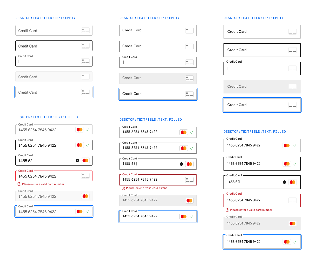
Every component was documented across its full state range, default, filled, focused, error, disabled, and validated once per brand. Here's the Credit Card field across all three: Saks, Neiman Marcus, and Bergdorf Goodman share the same structure and the same states, but each still reads as its own brand. That same coverage carries through to a production Storybook, so what's documented in the library is what engineering actually ships.
Cross-platform parity
The same rigor, applied to iOS
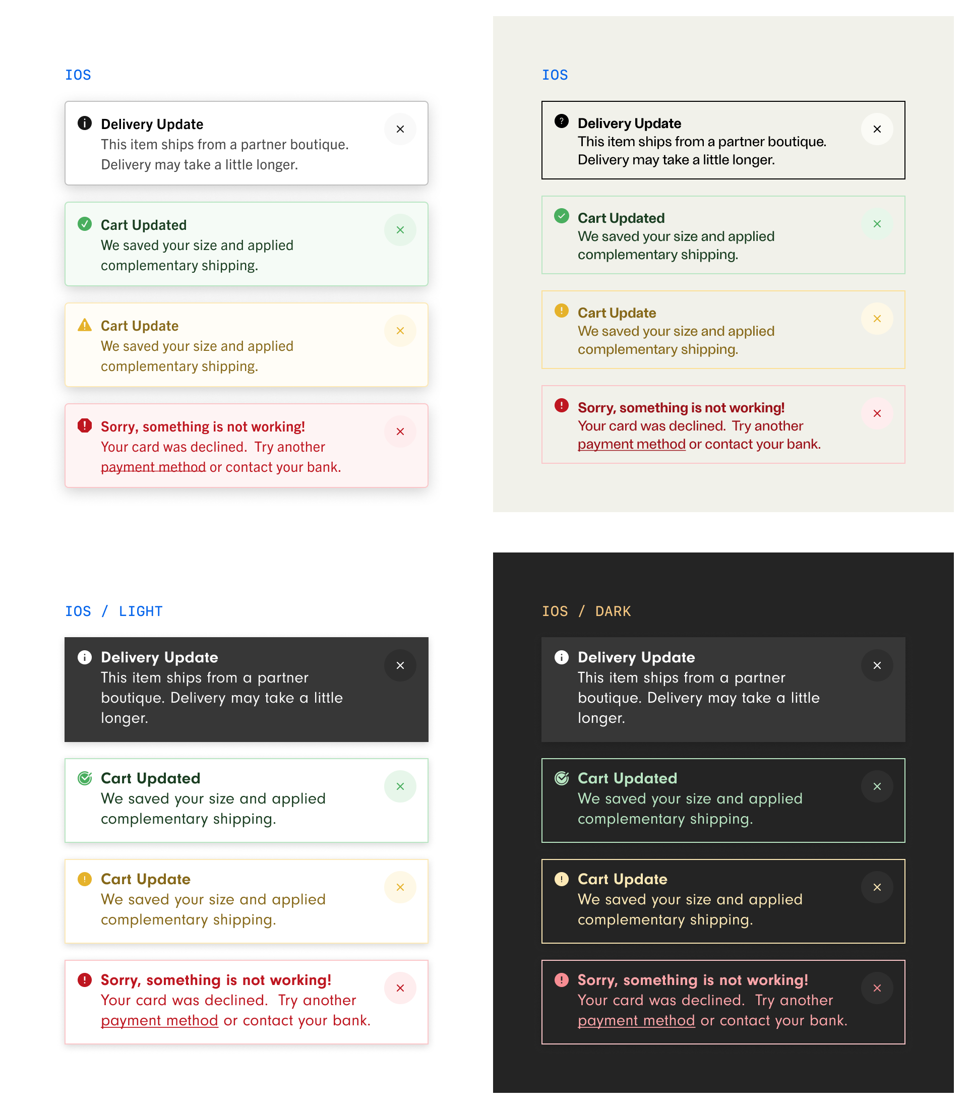
Native components were held to the same documentation standard as web, and the same multi-brand rigor. The Toast below runs real cart and delivery copy across Saks and Bergdorf Goodman, and, for Neiman Marcus, the only one of the three with a dark mode, across both themes.
In production
One Recommendation Strip, two live sites
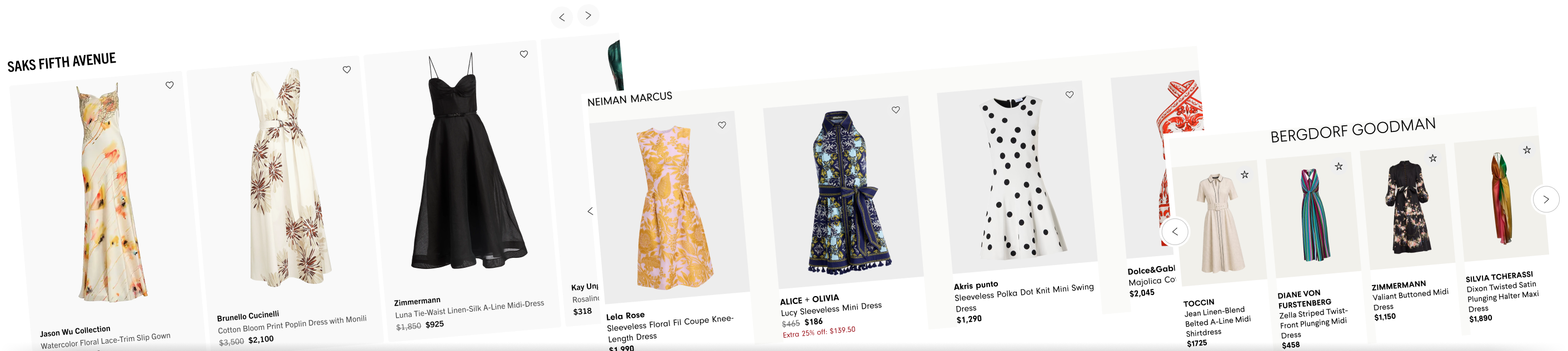
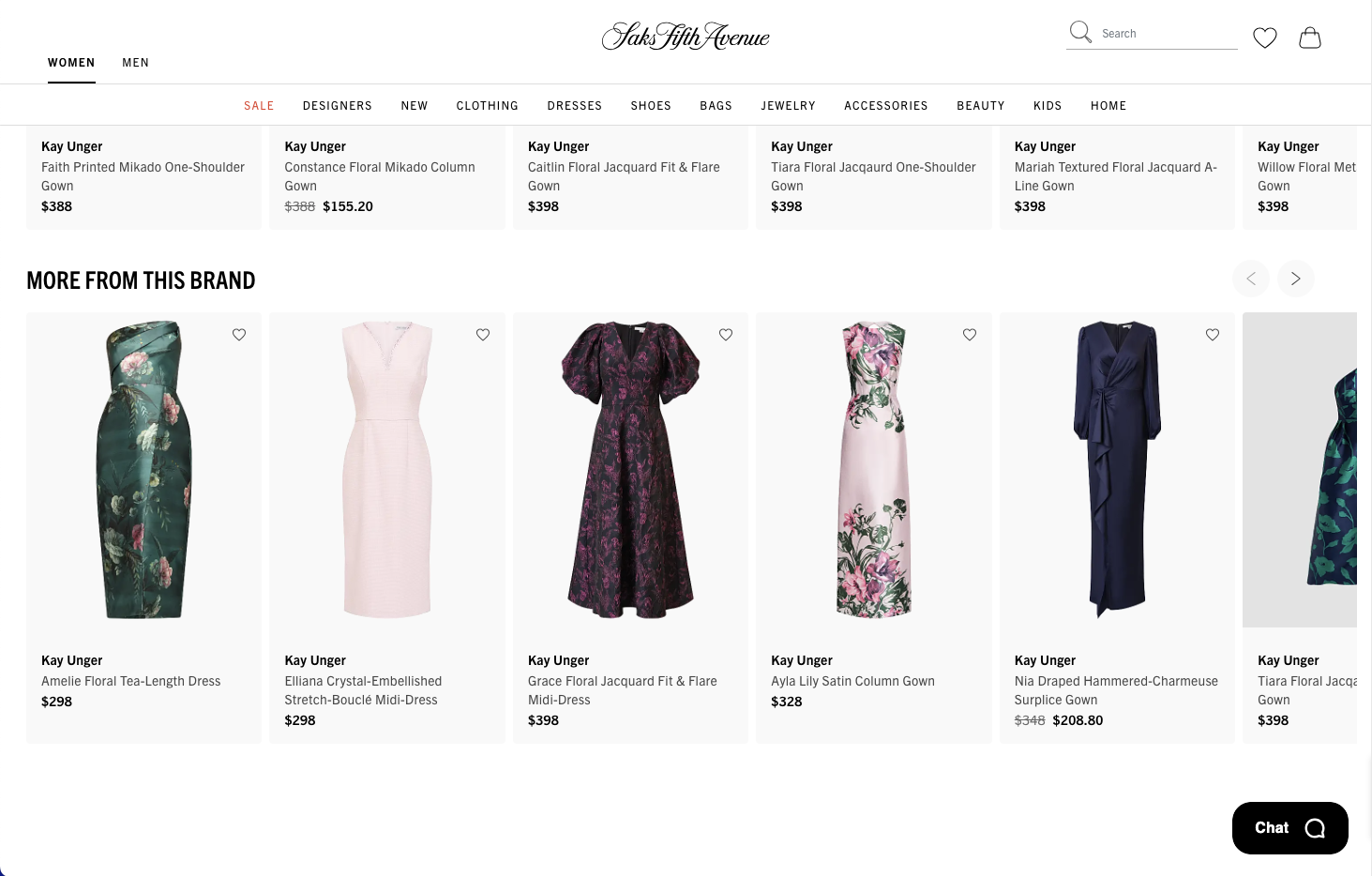
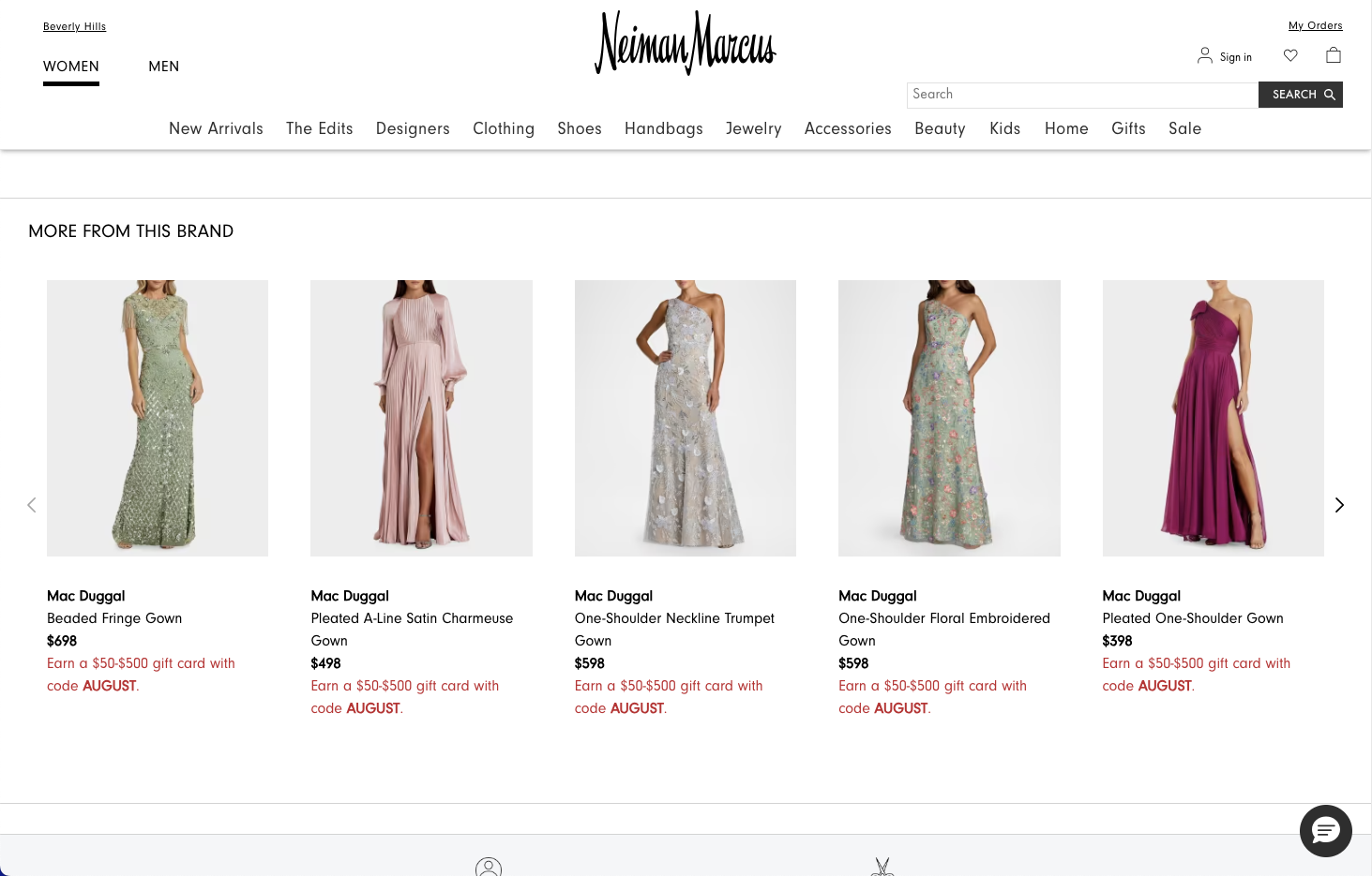
The clearest proof isn't a component sheet, it's the same Recommendation Strip running on two live sites. Same card structure, same interaction pattern, same underlying tokens, each still unmistakably its own brand. Saks and Neiman Marcus have it live today; Bergdorf Goodman is adopting it next, it just wasn't ready yet at the time of this capture.
Governance
Keeping consistency without slowing teams down
Governance here wasn't a form to fill out, it was a working relationship. Every new pattern followed the same loop: proposed against the brand and platform needs it had to satisfy, reviewed against the existing token structure, then built and documented in close collaboration with engineering, so what shipped in the component library matched what was designed in Figma. Keeping three product, design, and marketing teams aligned around one system took ongoing, deliberate coordination, not a single kickoff meeting.
Outcome
What this proves
Still early: the foundation shipped and all three brand teams are building on it, but adoption is ongoing, not finished. Here's where it stands.
- Architected and led a token and component system shared across three luxury retail brands, serving a platform with over 1.2M daily users.
- Took the system from token architecture to a documented, production component library used by both design and engineering.
- Built and ran the governance model connecting three product, design, and engineering teams around one shared foundation.
What I'd carry forward
- A design system is alignment work first, components second. The hardest part was never the tokens, it was getting three teams to agree on how to use them.
- Consistency and brand identity aren't opposites. The same structure can flex enough for each brand to still feel like itself.
- AI is already changing how systems like this get built. Faster token extraction, faster documentation, that's only going to matter more from here.